Lessons about designing software from 3.5 years of this website.
v1: the beginning
In May 2023, I created this website. I'd never touched JS, let alone React, but I was dying to write code that wasn't for EECS 281. So I followed the Next.js Pages Router tutorial (which back then was just the "Next.js course" since App Router didn't exist) and threw this together:

https://albonwu-4dsuktjxq-albonwu.vercel.app/
We all start somewhere! It's obviously derivative of the sample blog app but I think this was the first major lesson I ever learned as an engineer: copying is okay.
Rather, it's not intrinsically bad. I think it becomes bad when it replaces your human reasoning i.e., when you code an end-to-end application using Cursor. But I think it's fine if you're starting a project with no guidance and you need help mustering the activation energy.
Characteristics of v1:
- Super minimal homepage.
- Super minimal "about" section. I was in that phase.
- Just one post, but it loads super fast.
v2: scaling
At some point I got over minimalism and decided I had more to say than "Computer science and math at the University of Michigan."
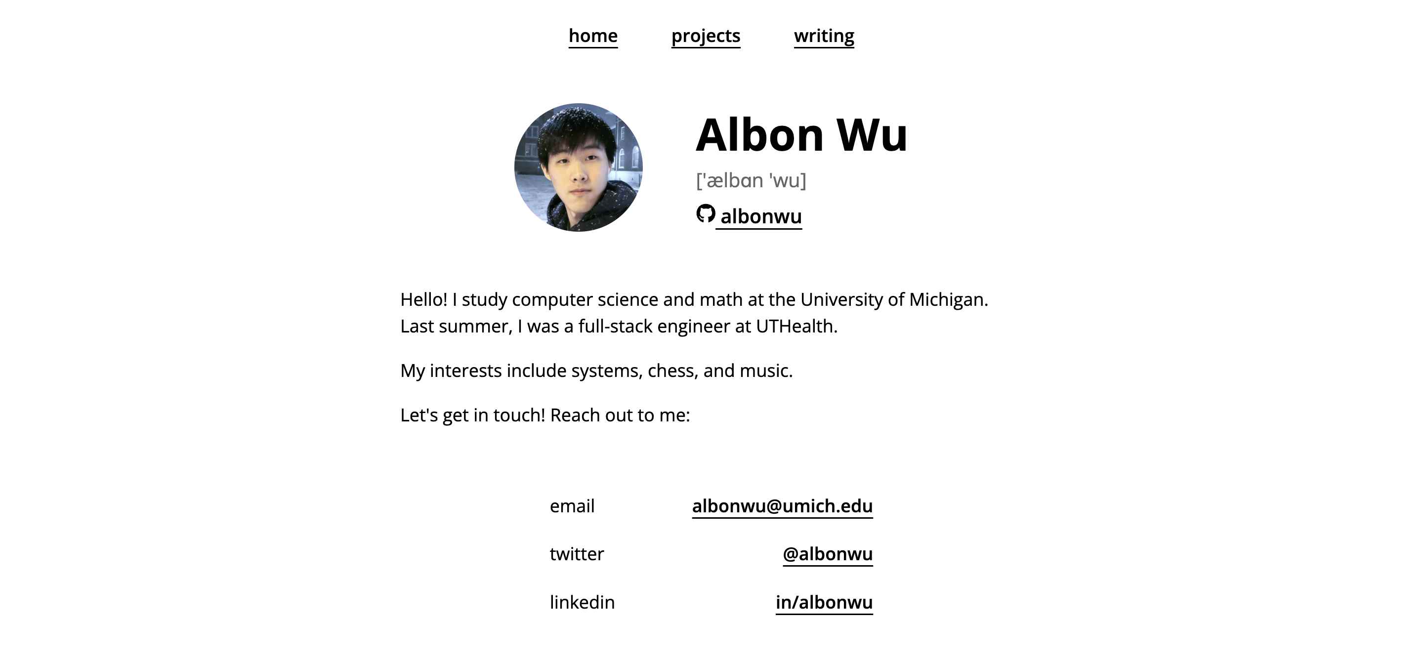
https://albonwu-qea1ygss5-albonwu.vercel.app/
Big visual revamp. This version is more informative and visually interesting, but still restrained. The navbar is just a bunch of links, there's no color anywhere, etc. This is a principle in many of my projects: there's less to mess up if there's less on the page. The UI is inoffensive; there's no design faux pas, no clashing color schemes.
Nevertheless, there's a bit of novelty here. Remember that just one generation prior, my site was essentially a clone of the Next.js tutorial. My contact info and name/GitHub/headshot are organized cleanly. Also, I added a dedicated section for projects.
Being inoffensive is pernicious
I use "inoffensive" in the sense of "timid:" intentionally avoiding risk or potential failure.
There's plenty this version does well, but you can see the trappings of technical debt. A user navigates into a section called "projects" expecting links to projects, and "writing" expecting exposition. Yet, pathologically, several links in "projects" link to articles, and "writing" is a grab-bag of static files.
This counterintuitive design is a good sign! I was doing more stuff worth putting on the website, and I had to organize it. But it illuminates that I had used minimalism to dodge hard design problems in v1.
I'm not saying brevity is inherently harmful - but it's so easy to latch onto when you're starting out and care about appearances. It's difficult to make a tacky website if it's aesthetically minimal. If you feel that way, then you treat "less" as the starting point.
But I should have done the messy work first: reasoning through and committing to a structure, then stripping away unnecessary bits. Brevity should be a choice, not a crutch to avoid making hard design decisions.
v3: departing from brevity
Which brings us to today.
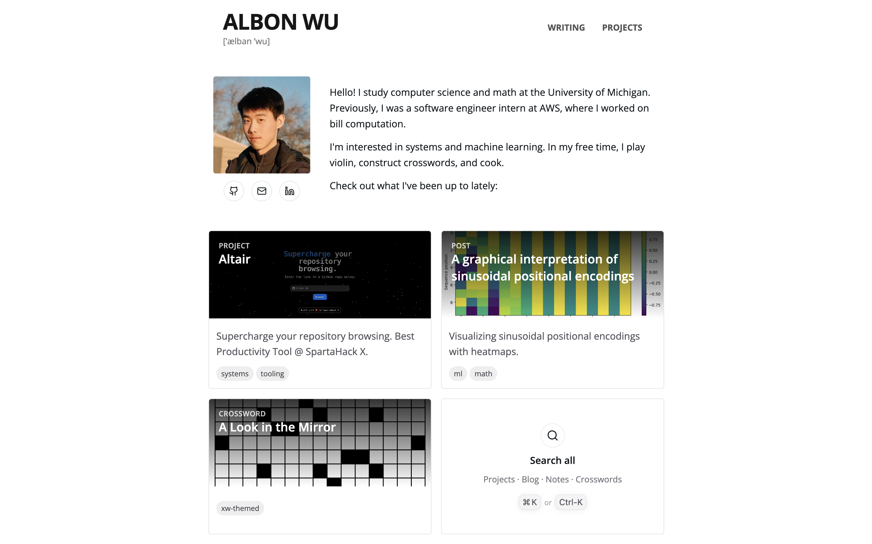
Scalability is an even bigger concern now that I also put crosswords on here, so I added a search box. Also, no more minimal links: all writing and posts are styled cards with tags. To fix the "writing in projects" issue, I added a dedicated link in "projects" and turned the old page into a blog post.
This version is by no means perfect. And I omitted a lot from the evolution story - along the way, my posts got LaTeX and CSS support, I implemented intelligent 404 autocomplete (try it), and caches to improve post loading speed.
I learned a lot the past three years - we'll see how version 4 turns out.